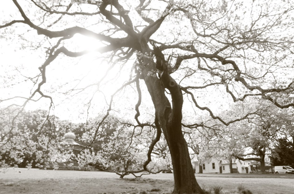
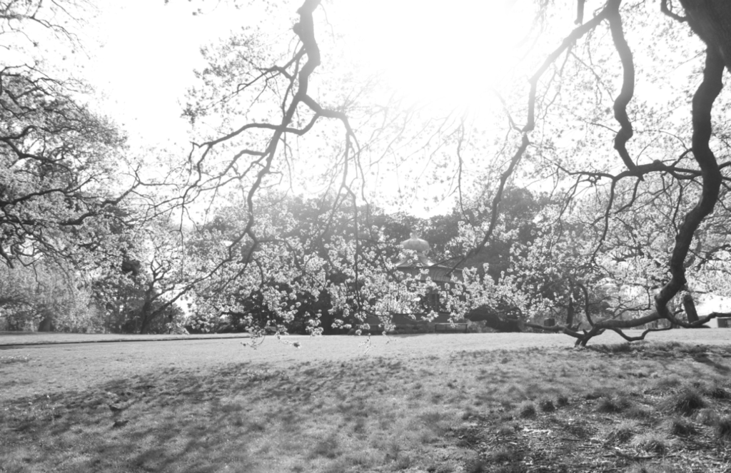
Film photos
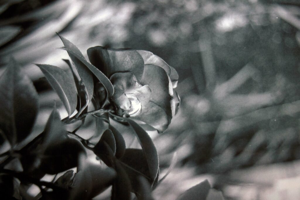
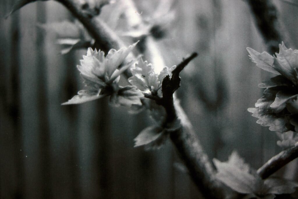
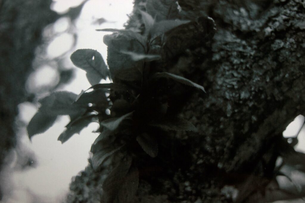
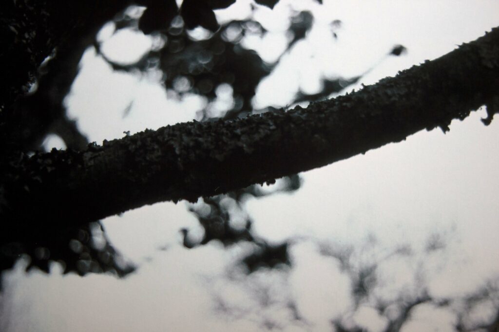
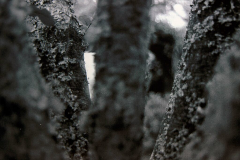
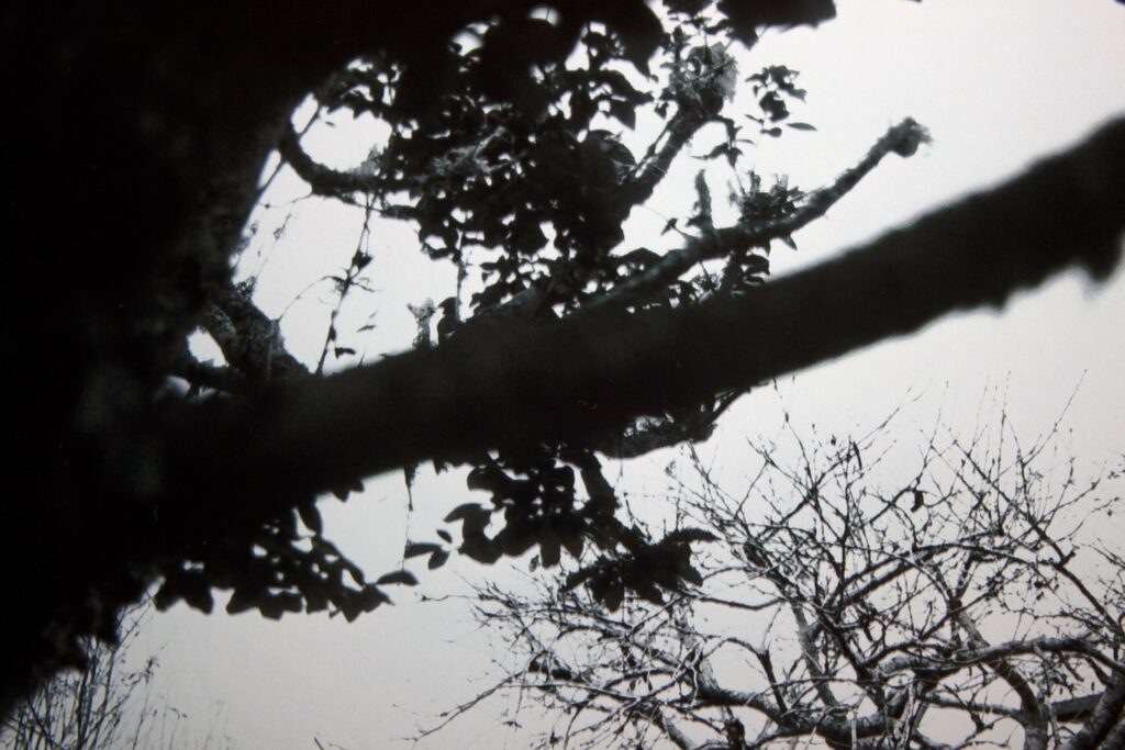
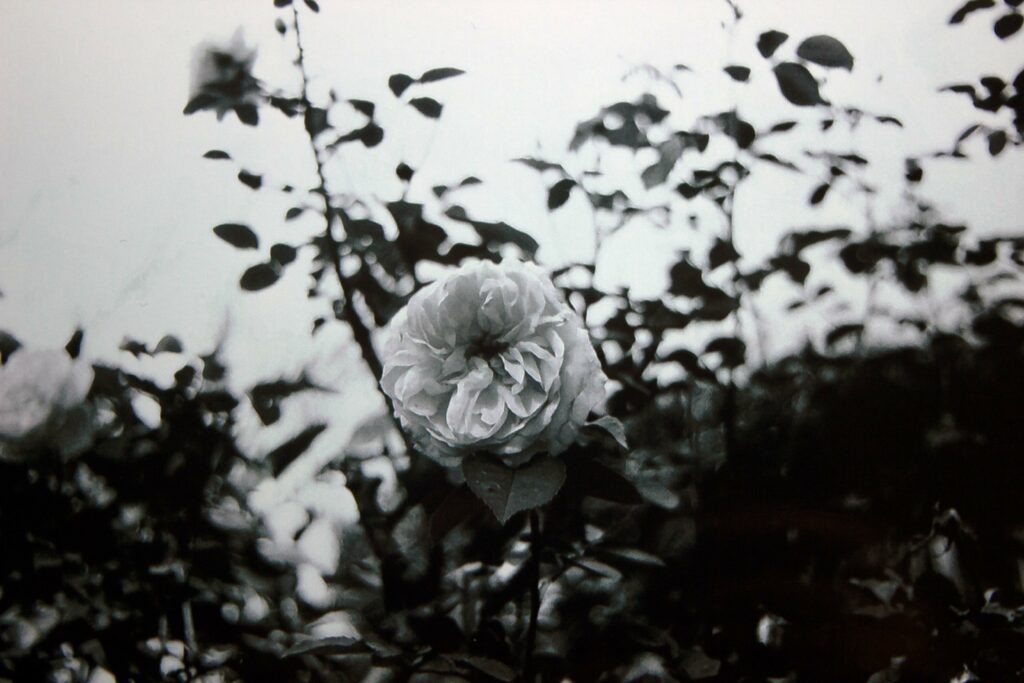
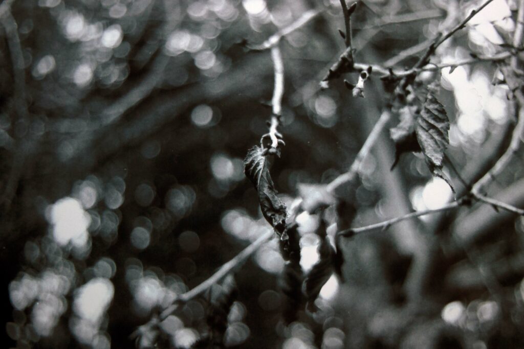
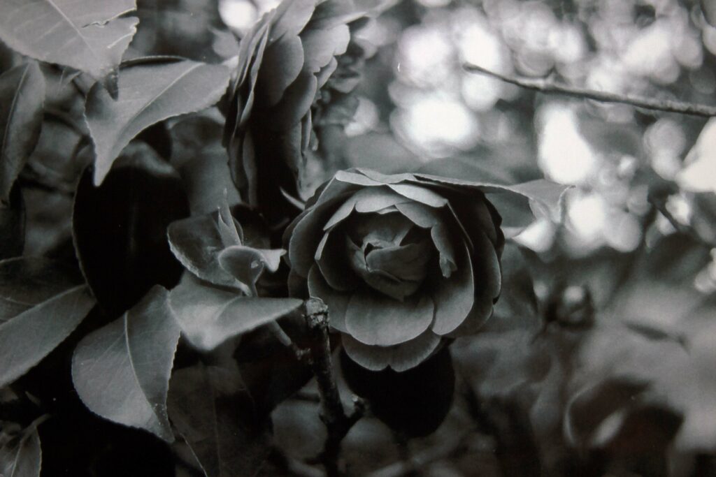
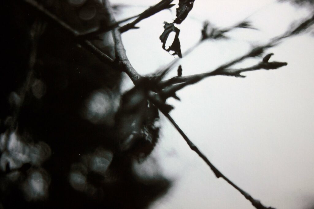
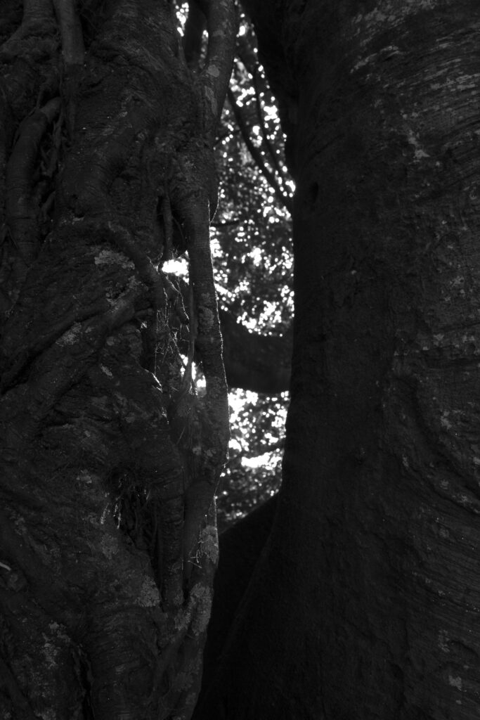
These were the photos that were clear enough and the main images that I have put on my wall. It was my very first time using a film camera, so I was a little nervous. However, I used my instinct to pick interesting places around my garden and understand how this camera works differently to the modern camera out today. I used an older film that was creating a grainier look though looking back at these photos I don’t see much grain. To be honest this is almost clearer than my digital camera photos and I don’t understand how. I took 26 images, and my favourites are 1 and 2 (going across the top row) and the last 4 flower/ leaf images.
The tone of the film was different to using the monochrome setting in my DSLR. Its darker and has the fuzzy kind off blur. I like how that differs. I’ve looked at photographers that used old film cameras like the Nikon in the past and I’m amazed to see the difference in quality. I thought using an old film would be grainier which in itself has its own texture. I took these photos on an overcast day where the sun wasn’t harsh, so I think that’s what made the images.
The natural lighting was so subtle in how it created the images with the circle effect. I wasn’t expecting it to be so strong in presence but also clear in the shapes.
Photoshop experiments
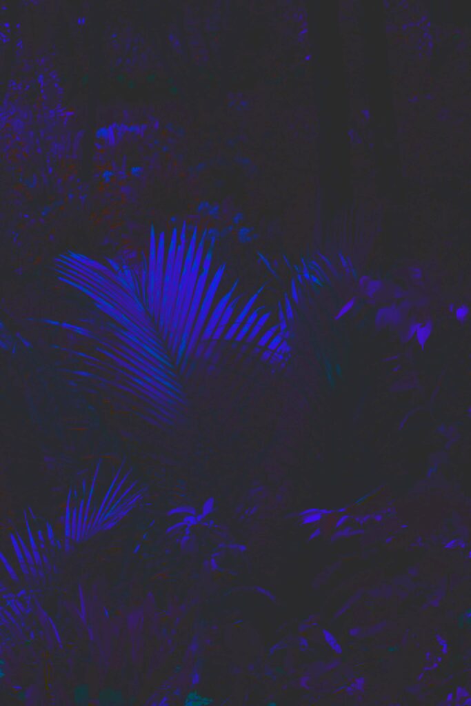
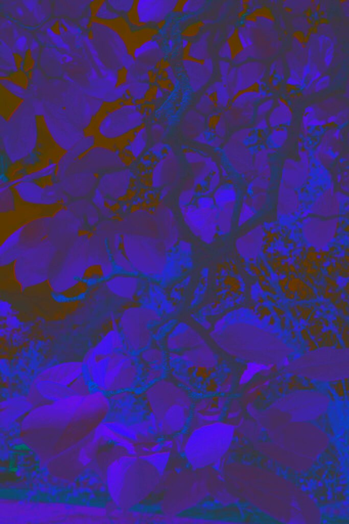
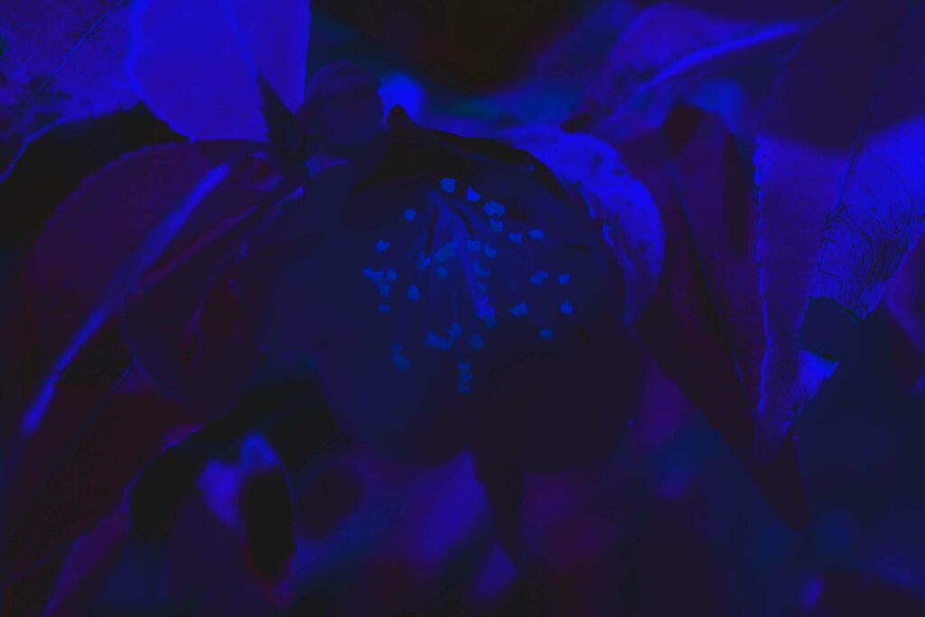
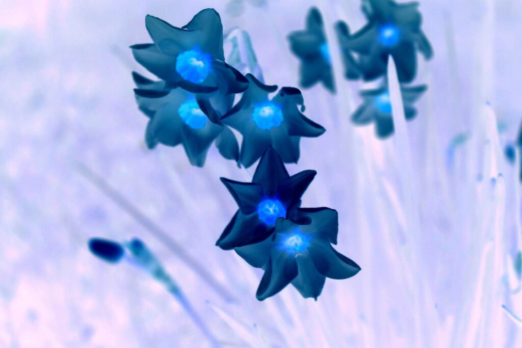
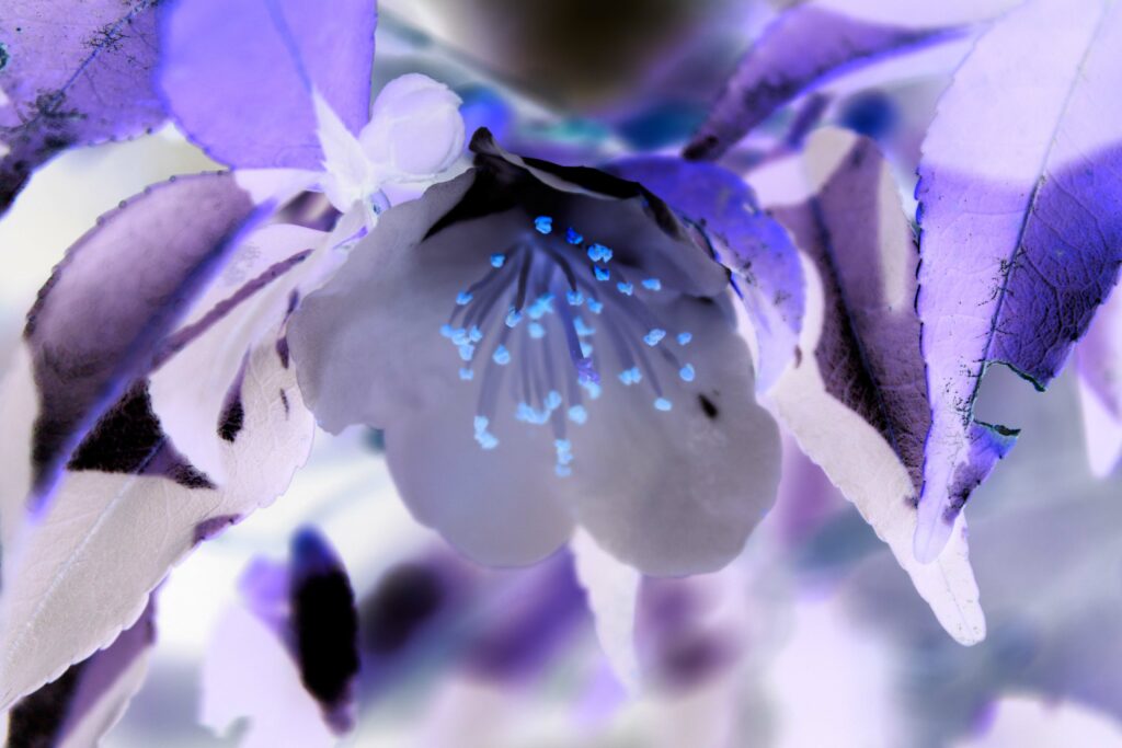
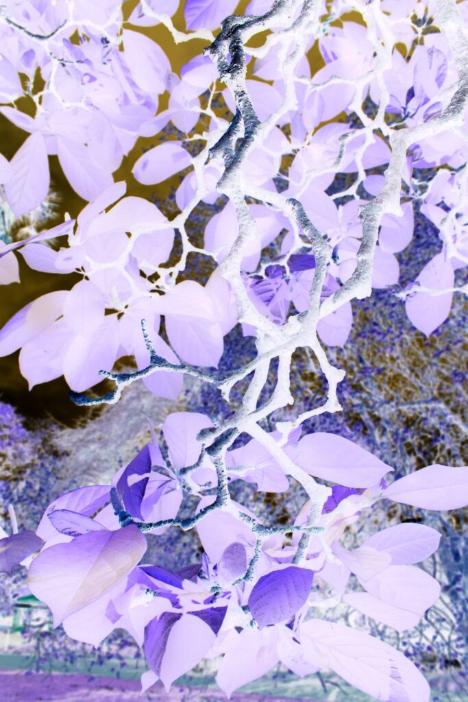
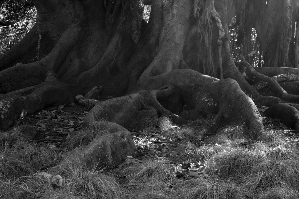
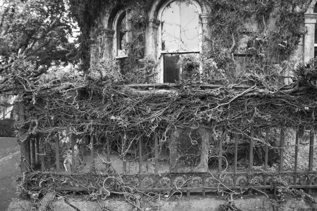
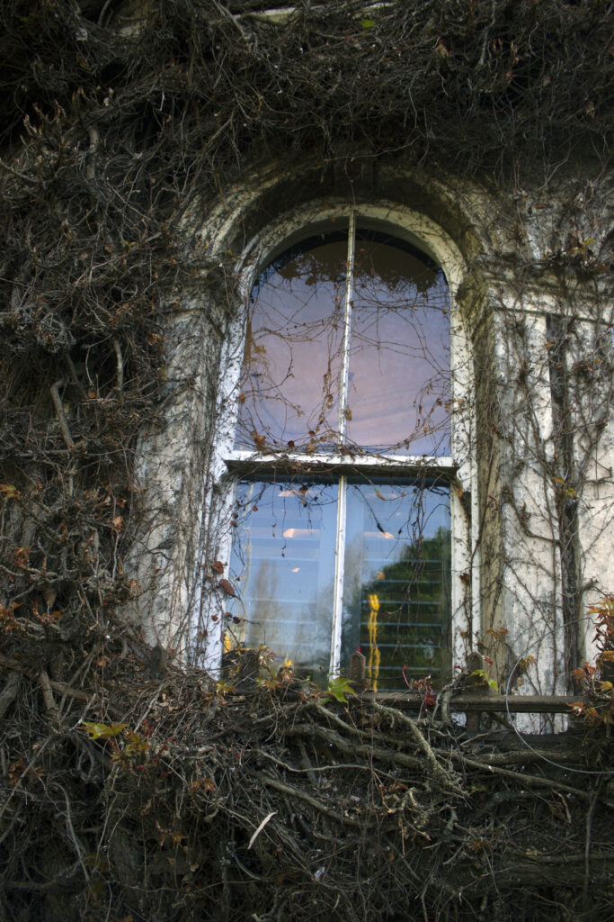
I inverted these images before I photoshoped them and that allowed me to apply a solid colour fill to change the image entirely. I chose purple and blue because those colours give the nature a curious almost mystical look to it. It also reminds me of x-rays and examining leaves etc on the light box. To me these plants look stained with some type of chemical and that relates to the cyanotypes. Instead of doing the cyanotypes I created my own. I was interested in the manual process however for me I wanted the detail to stay in the images rather than blocking it with light. These photographs were taken at the botanical garden, and I used that location since it is a reconstruction of what nature looks like without the natural feel since there is human intervention to create the gardens itself.
I don’t really have any artists to be inspired by its more my own ideas and how I can relate them to the brief in a creative way. I did research when starting the brief however I went off to try my own ideas and using what I have learnt in the past to influence my new work.
I originally was going to put these photos up on my wall, but I didn’t feel like it connected to the other images, and I thought it would be a distraction. After the critical discussion I removed a few photos and rearranged the remaining ones so I could have more room to put my film photos.
Slow shutter speed and landscape
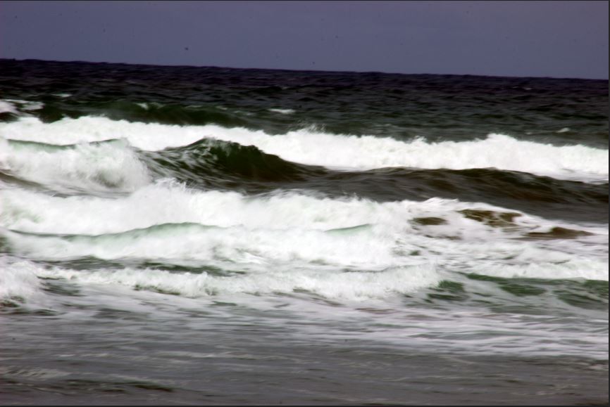
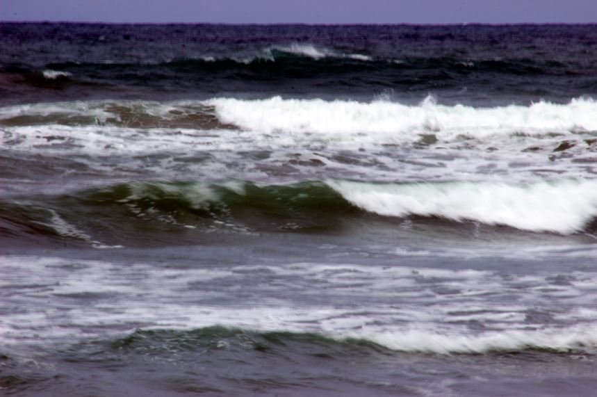
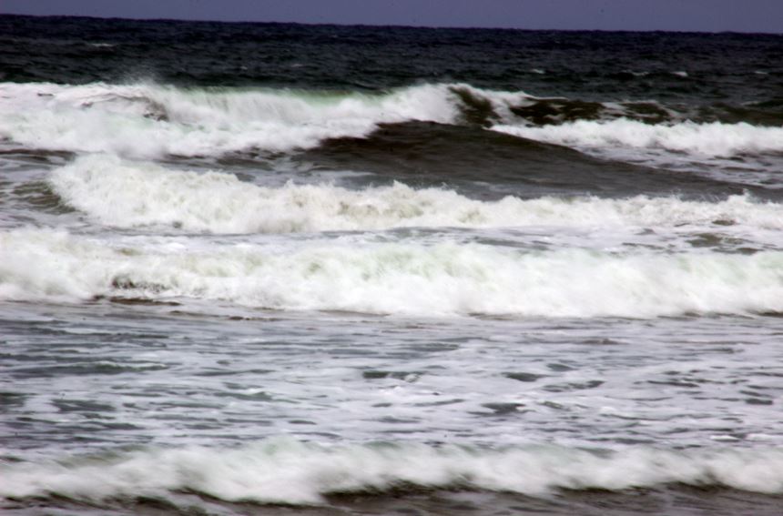
I went away over the weekend to Gisborne and while I was there, I used the opportunity to take photos of the beach. I used 1/25 shutter speed to change the water to a softer tone. This experiment was to explore how technology can change the way we see something using techniques that we have learnt. Nature creates the image for us and then we change it further to enhance its beauty. Using a zoom lens (75 to 300mm) I was able to get closer to the waver to create that change. In the images you can see the water blurred or less rough and that it what I was aiming to do. I tried the same technique with tap water but there wasn’t enough light and water to be able to make much of a change. Also, I was having trouble with the exposure and shutter speed however the light was bright enough so I could get correct exposure while changing. This is the first time that I’ve done this and I’m glad that it worked out to how I wanted.
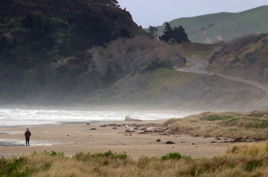
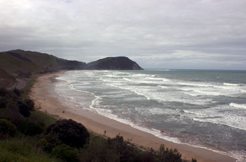
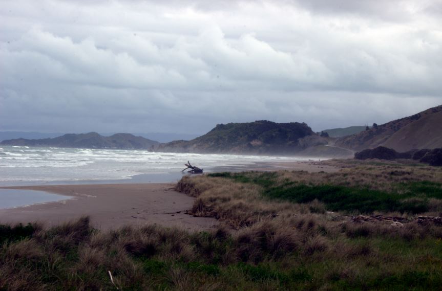
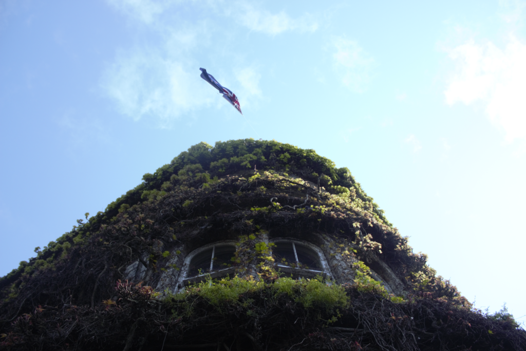
The second colour image was taken with a super wide adapter and from a viewpoint. Using the wide angle rather than just my standard lens alone helped create that image. What I like about these images is how it’s all nature. No man-made construction like the botanical gardens. I think I missed the chance to recreate the image with the sun set however I am going to the bottle top bay for the sun set. Using the light itself to create its own story. I would like to enlarge the colour images to put them on my wall, but the printer doesn’t have colour as an option.
Day 2: Research
Photography techniques to explore:
I want to learn how to change water into the smoke like quality I’ve seen from other photographers. So I’m using these websites are inspiring and as a knowledge bank.
Best Shutter Speeds for Moving Water (kenrockwell.com)
https://www.stuffmakesmehappy.com/2014/02/breathtaking-nature-photography-of.html
Athur Morris is a photographer that I have found interesting as the colours and camera angles vary between each image.
About Arthur Morris « Arthur Morris/BIRDS AS ART (birdsasart-blog.com)
As well as Daniel Ernst.
Daniel Ernst (danielernstphoto.com)
What I like about these photographers is the crisp clear images they produce given the high quality lenses they have. Also the type of lenses they use and where they take their photos. I don’t have expensive lenses like they do but I can replicate their techniques using my own equipment to understand more about my camera. I will start practicing the water technique this week in order to connect more to nature through my photography. Also using the film camera to do a comparison to modern day technology.
Photography week 2: Day 1
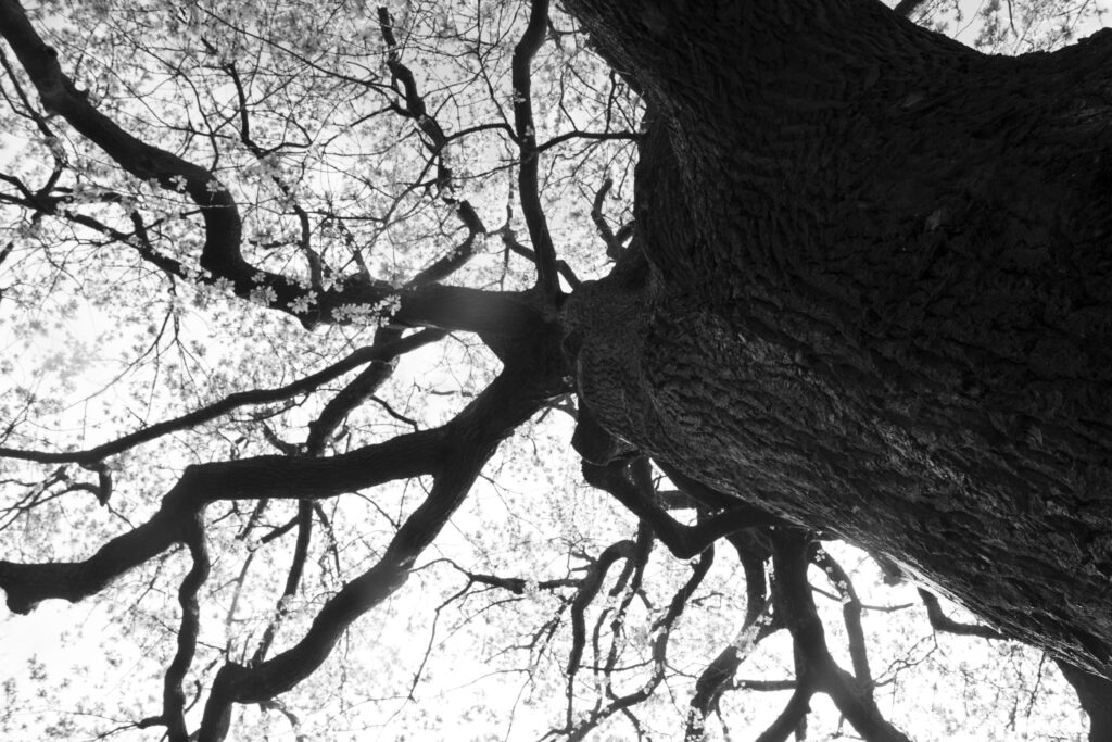
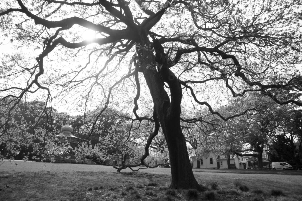
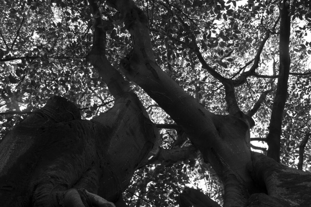
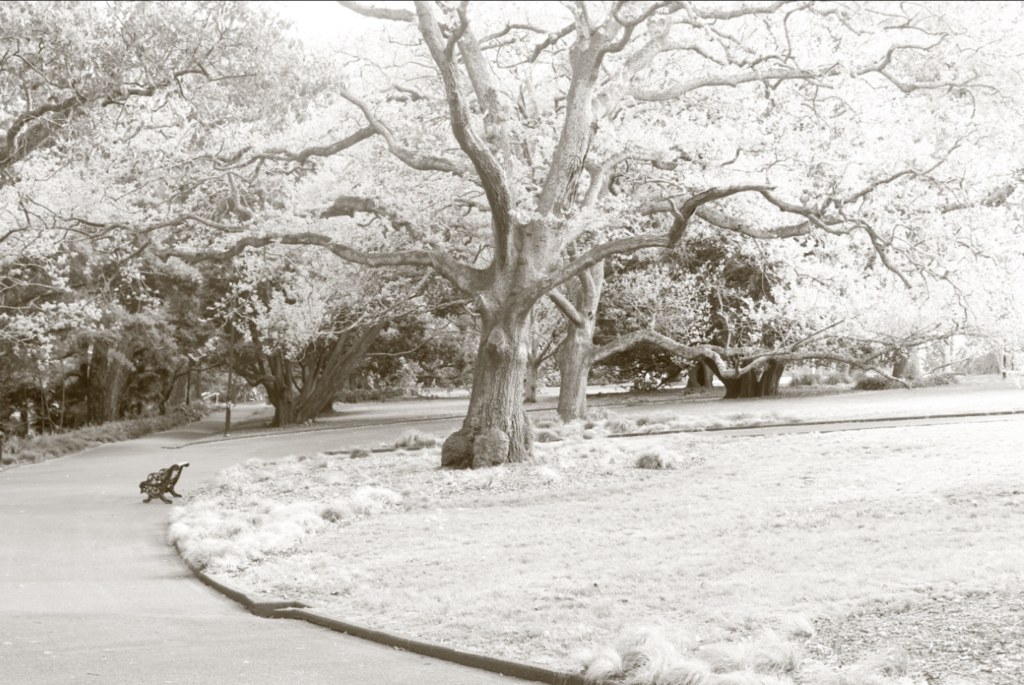
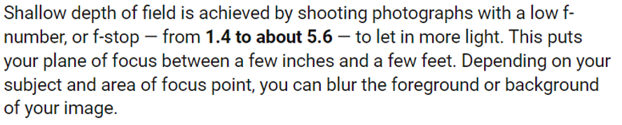
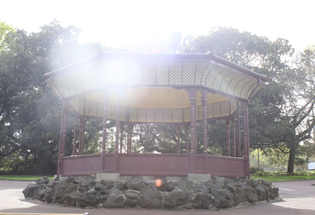
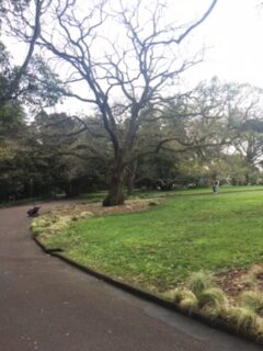
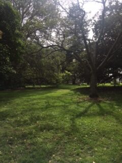
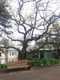
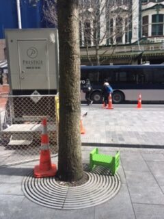
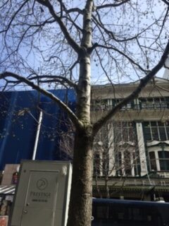
These photos were taken mostly at Albert park. When I take images I take a monochrome and colour then decide which one looks best to show. I like colour enhances the definition of the image meanwhile monochrome focuses on shades. Even though it is a overcast day the sun still shone through the branches to give rays of light and difference in tones which is what I was after. I used my standard lens rather then my zoom so I could get the whole tree rather than part. I also didn’t want to depth of field for this task unless if it was for the building. I also had to be careful on what angle I used for the tree photographs as the sun was beaming heavily through the leaves it would create a light circle that ruins the image.
Here are some of my failed images:
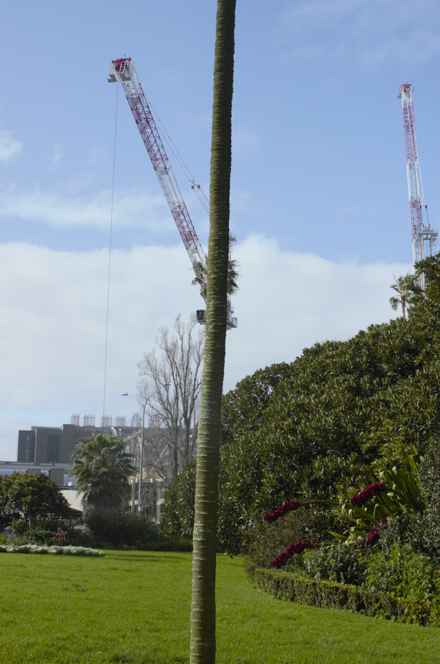
The light was too intense at that moment so I changed my angle slightly and used a tree branch to block the harsh light. For the palm tree crane image I was trying to link nature with manmade structures. Lining the palm tree up to the crane to make it look like the palm tree is part of the crane.
Finding ideas: Searching “Being in nature photography”
Google image ideas:
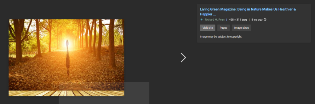
I like the top search response more as there is leading line, shadow, composition, rule of thirds and colour etc that draws our attention to the person in the middle.
Photography week 1:
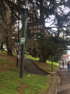
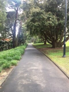
First time going to Albert park so it was nice to have a look around and see what photo opportunities there are. The massive trees are quite magnificent and huge it almost takes your breath away. Also with the park being in the central city its amazing that trees can grow to that size. These photos are just snapshots of nature spots I thought we be interesting for this brief. Being an overcast day the shadows weren’t that visible which is ok since I was exploring.
I did do a brainstorm of what places would fit in with this brief.
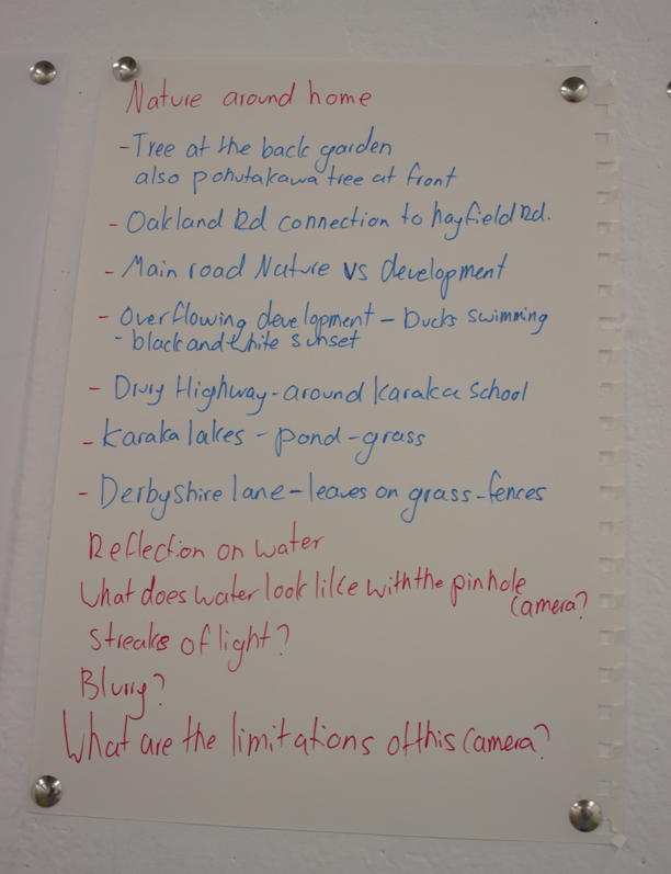
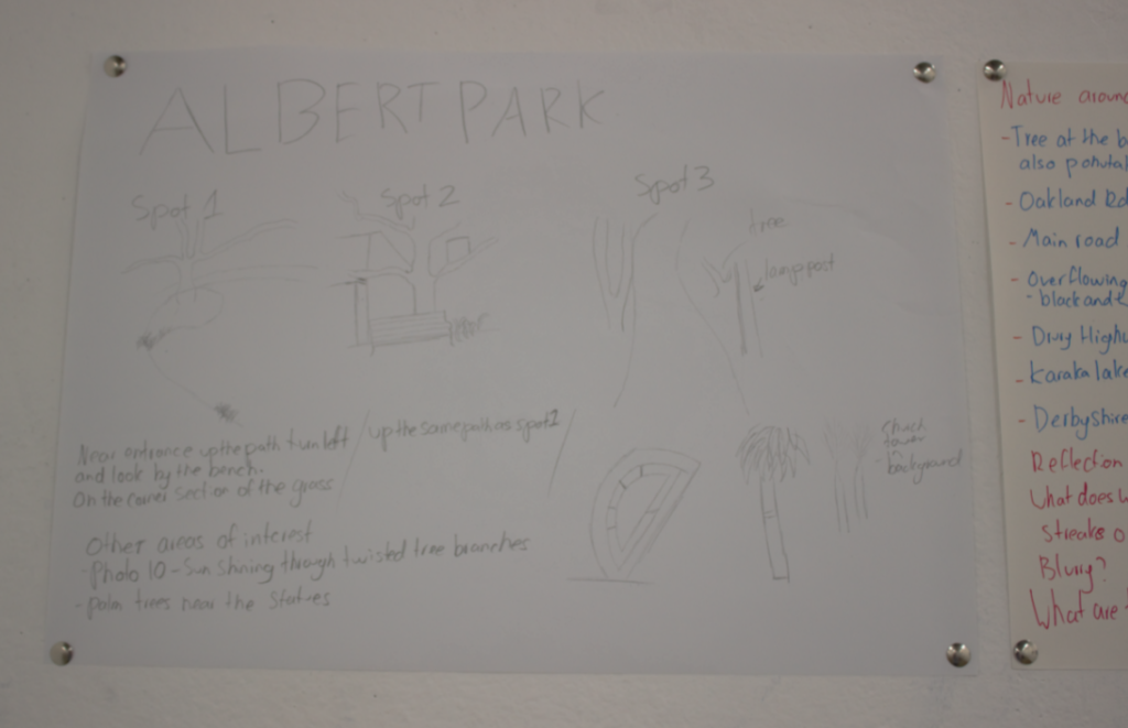
Using Albert park as a starting point I would then go and explore my local area as it has different scenery all together.
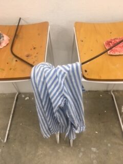
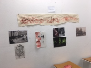
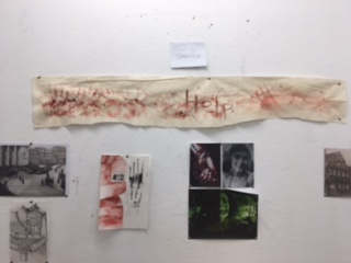
Sculpture Week 6:
Experimentations:
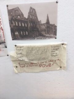
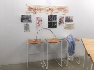
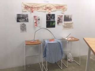
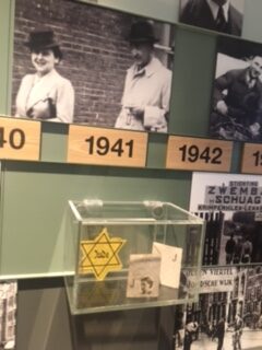
I looked at some Holocaust themed art works before doing adding to my workspace.
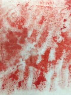
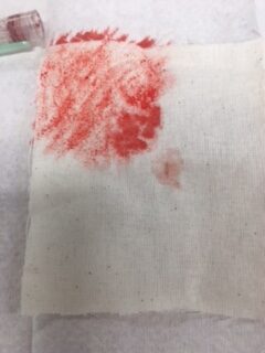
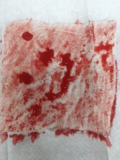
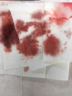
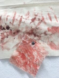
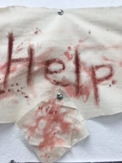
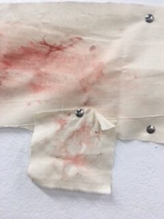
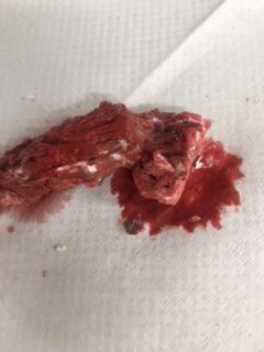
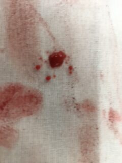
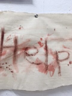
The small cloth squares with fake blood is to reflect the thousands of blood stained bandages. Making a replica of those to reflect what was being seen on a daily basis by the soldiers.
Art from the Holocaust: The stories behind the images – BBC Culture
Artworks that reflect my art style are

Studio work sculpture week 5:
Hand Sculpture:
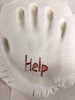
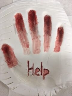
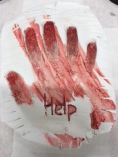
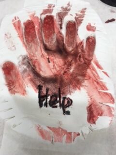
I focused on using my hand to create this piece from researching memorials I got the idea. This is to represent the moment where the Jews and other minorities are trapped in the gas chamber. I looked at some photos as inspiration as to how I could relate to that moment in respect, I want to show the vulnerability that these people were in. Using resources that I have from last year, I’m basically carrying on that project in a different way. To spread the message of how tragic war is.
Water colour soldier:
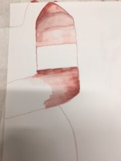
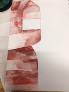
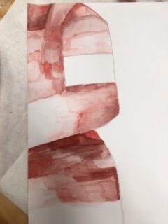
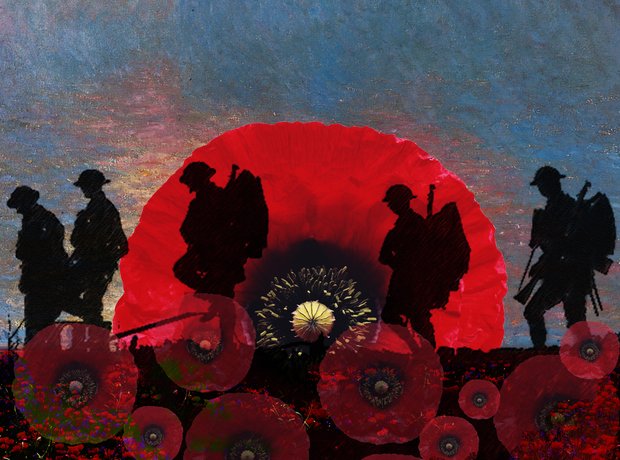
I chose to paint this water colour soldier in red. As red is a symbol of violence. It also looks like a coat worn by the Jews. I left out the Swastika to be respectful to those “glorious dead”. I replaced it with my thumbprints as a symbol of strength and coming together to help each other. In Anne Frank’s diary she talked about how her family was being helped by outsiders in order to keep her safe until her location was revealed. We as humans have the natural ability to help others and pay respect. This project is me being respectful by sharing the stories of those who could not tell themselves.
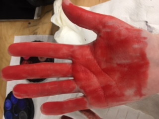
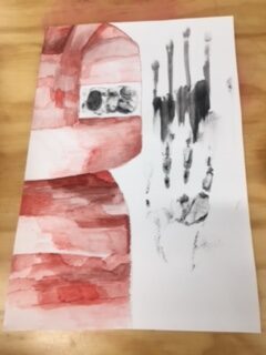
Marks:
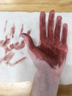
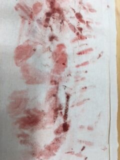
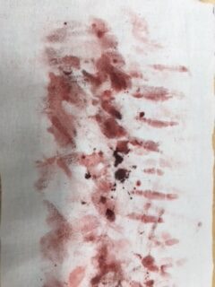
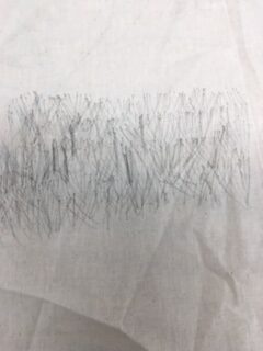
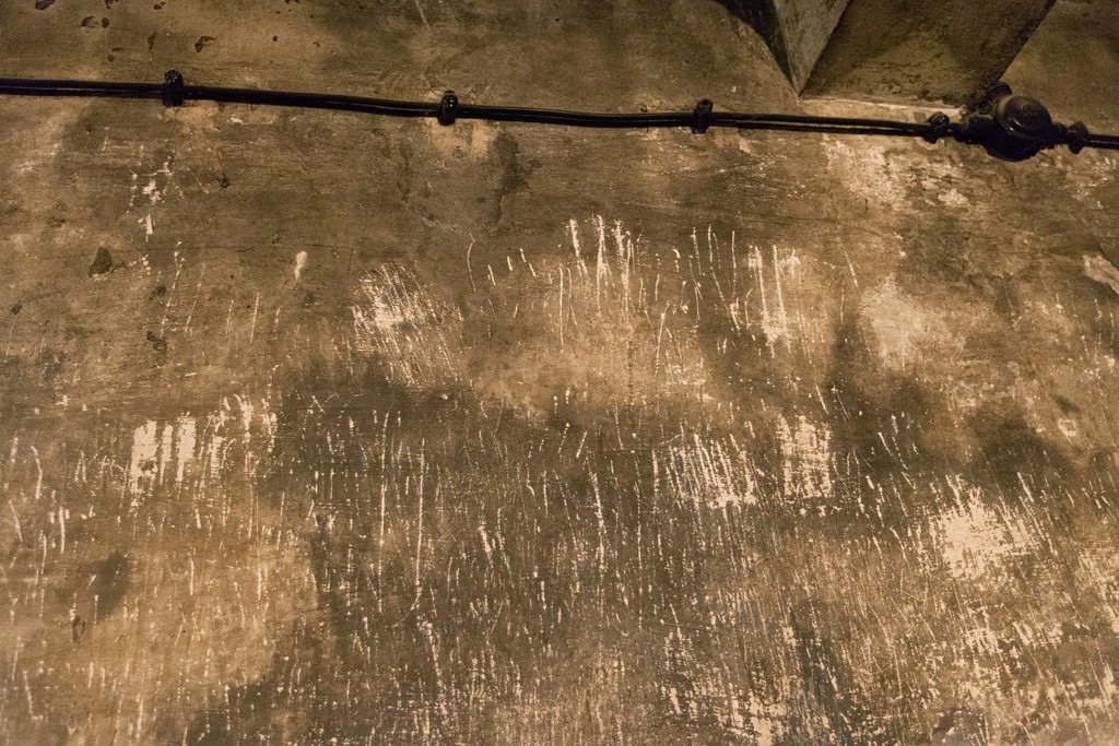
This is also a reference to the gas chamber markings. Painting my hand in red water colour to show the blood and stress that the people had endured. Doing the similar actions as them, I was thinking about how they must have felt, knowing that they would die no matter how many times they scratched the walls. I felt helpless and overwhelming sense of realisation. I remembered the many descriptions and photos that I had seen before and I stopped half way. The reason I stopped was because I felt proud that I’m doing this. Not many teenagers would understand where I’m coming from. History is a powerful tool for future generations and learning from it, seeing the bad side as well as the good one of the only way people are going to understand how lucky we are to live in this society.
Phase 2 Week 5:
Holocaust Memorials:
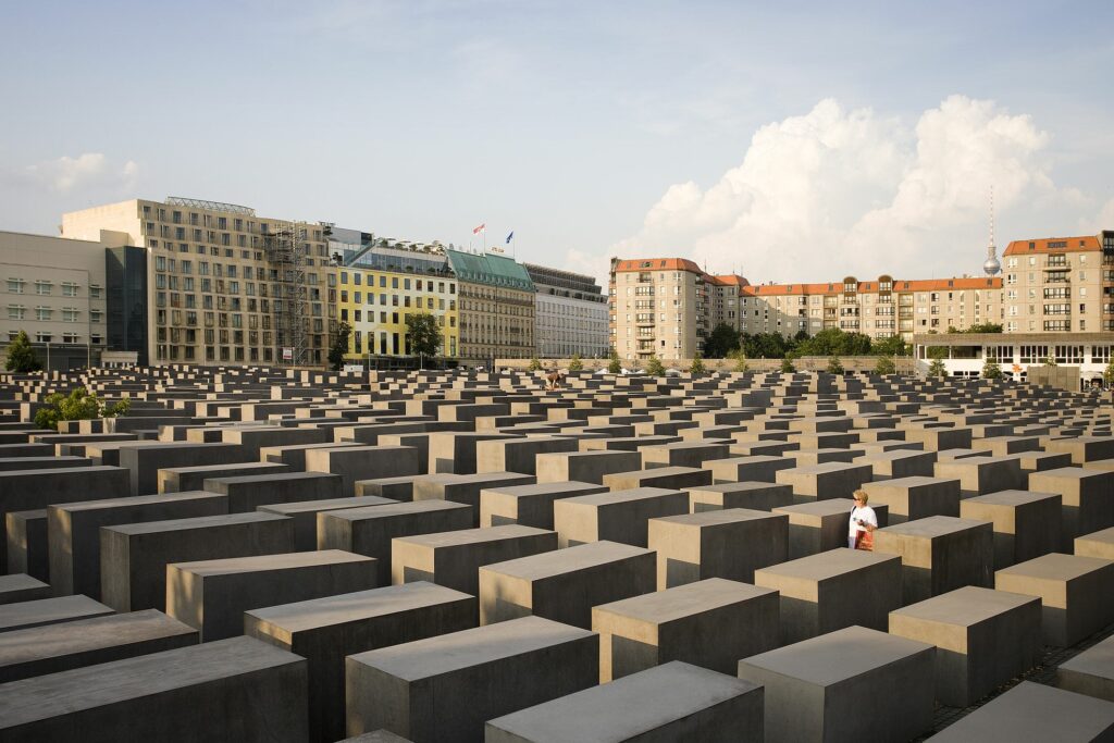
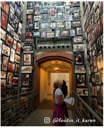
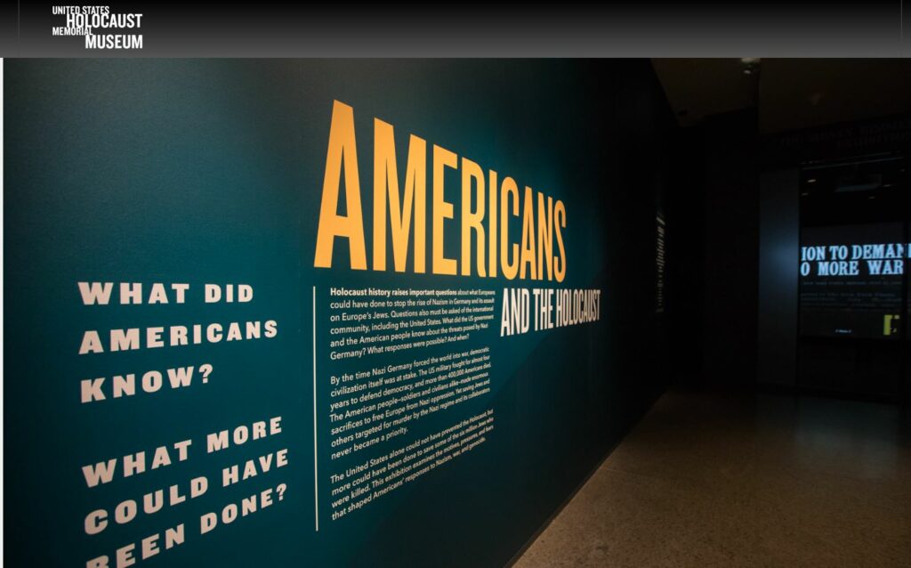
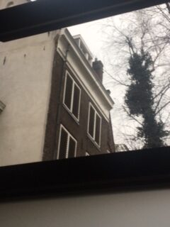
In 2019, I went with my family to the Anne Frank house in Amsterdam. In 2016, I went to the US Washington Holocaust Museum. Both experiences were surreal, I cannot unsee what I saw. When I was walking through both places I could only imagine what my great grandfather saw when he went to Auschwitz.
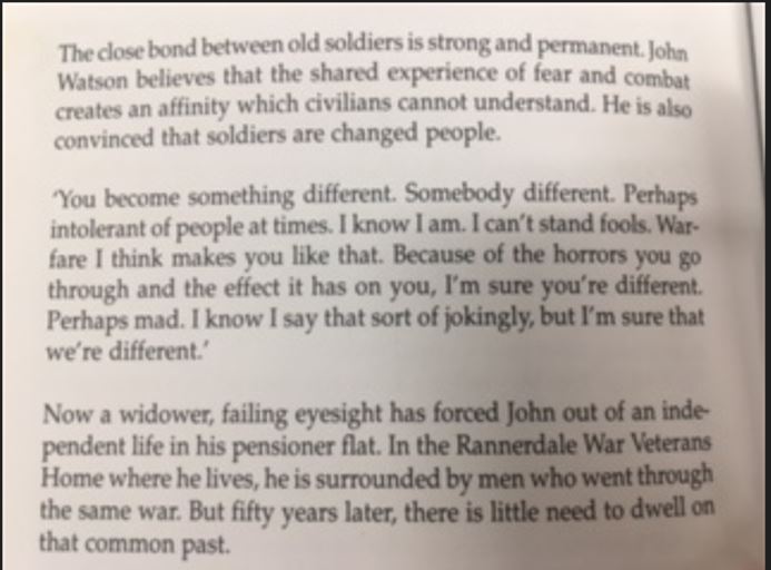
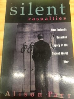
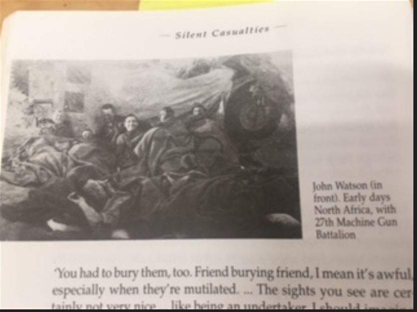
My New Zealand Great Grandfather was involved in a book called Silent Casualties. Also fighting in the Second world war and surviving this book retells the stories.
Artist research:
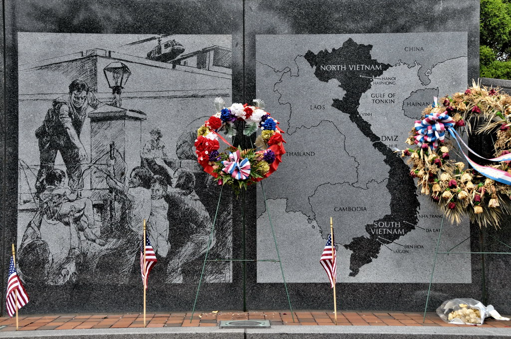
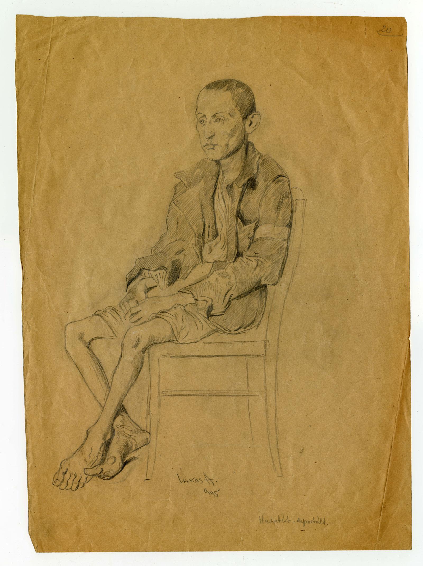
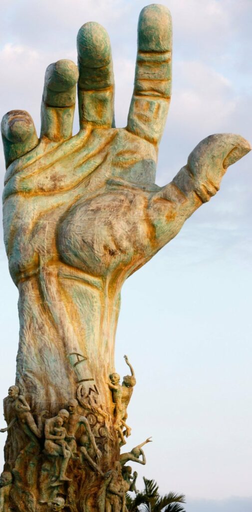
This memorial in Philadelphia commemorates the Vietnam war. On the left you will see an etching. This work shows the desperation among the children. How this relates to my work as I can do some pen sketches, as it is strength. I could also do pen work directly only the clay or plaster. I am thinking of doing half plaster moulds and having them stand up. Then drawing from the inside and onto a piece of paper as it is coming alive as well as to show the connection to physically touching to only seeing something.
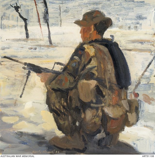
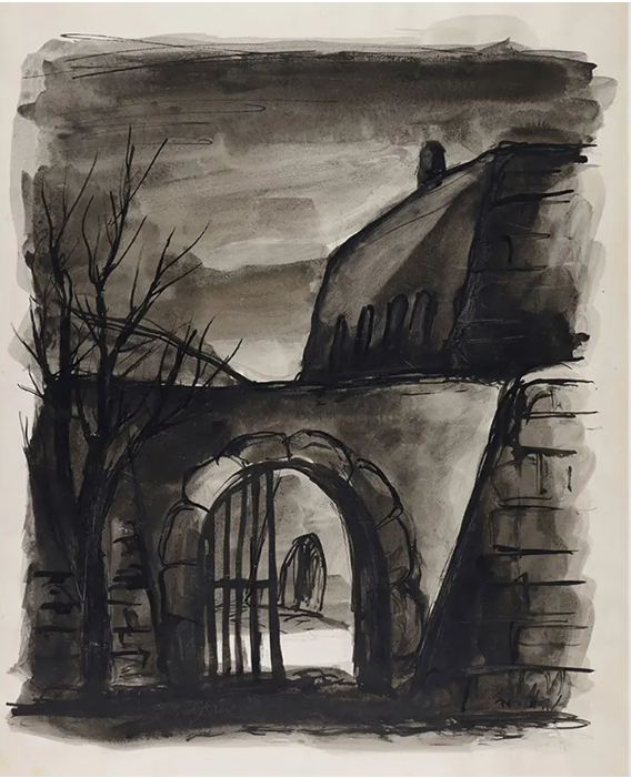
I found Rick Amor’s work by searching up War memorial art. I like how this captures emotion, the colours of the oil paint relate strongly to the military but also give uncertainty as the person looks out into the distance. With war one’s fate of whether they would return home was the demon lurking over every man’s shoulder. I can try to use similar colours to give more meaning to my work and make sure people feel the correct emotions. I want them feel disgusted, sad, speechless but also fascinated by my work. I am doing this for a reason.